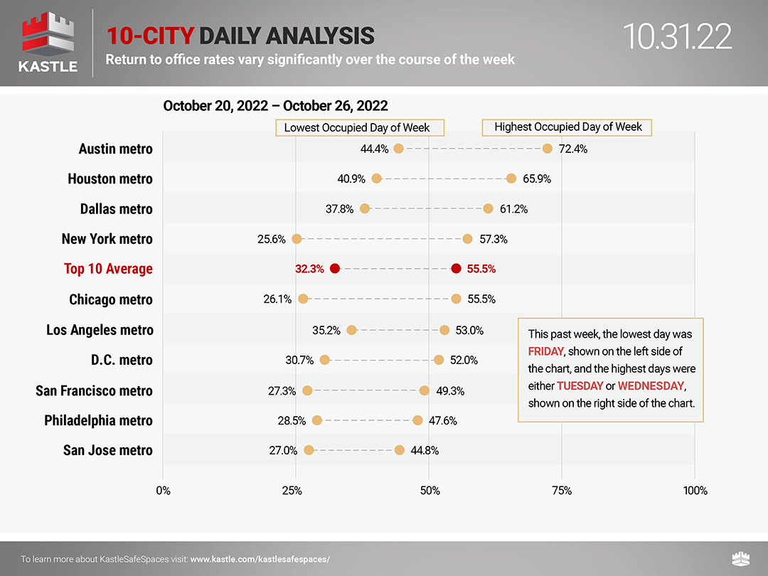
New data from Kastle’s Back To Work Barometer shows office occupancy rates vary significantly over the course of the week. The ten-city average last week peaked at 55.5% mid-week before falling to 32.3% on Friday. Every city tracked reported its highest occupancy rate on Tuesday or Wednesday and the lowest on Friday.
These daily oscillations help to explain why anecdotal reports on office occupancy can be dramatically different. For instance, if you were to enter a workplace in New York on a peak day, you might be inclined to report occupancy as 57% without taking into account that the rate is only 26% on Friday when you, like most New Yorkers, did not come into the office. Going forward, Kastle will share this data to help provide more clarity about return-to-work trends. Our legal barometer, which includes a number of higher-end buildings, also demonstrates that occupancy disparities exist among different industries and types of buildings.
The Barometer’s Breadth and Dept
No publicly released data set comes close to the Barometer’s depth and breadth. Kastle has more than 1.8 million total users globally and the Barometer is based on the actual behavior of 300,000 of these cardholders in the 10 markets we report. Most of our data comes from Class-A buildings as well as individual tenant workplaces that Kastle secures within buildings. But importantly, our data set includes a range of other buildings that make it more reflective of the ten commercial real estate markets we track and publish weekly.
The American Economic Association notes that the data collection method the Barometer employs – Administrative Records Data (in our case, card swipes when someone enters a building)—is a better way to understand behavior than surveys measuring attitudes, especially given the scale and duration of our monitoring.
The Barometer was designed and is managed weekly by data scientists with decades of experience in large, sophisticated government data projects. Our approach relies on a meaningfully larger data set than many of the most trusted surveys that use data to understand other trends. For example, the New York Federal Reserve Bank’s Survey of Consumer Expectations is an internet-based survey of a rotating panel of approximately 1,300 household heads. The Consumer Expenditure Survey of the Bureau of Labor Statistics is based on monthly interviews with 20,000 households. Nielsen bases its television and radio ratings on daily meters in just 15,000 households nationwide. Kastle’s data set is robust in comparison.
Consistent Alignment with Other Back-to-Work Indicators
Kastle’s data consistently aligns with the other available datasets tracking back-to-work trends. The Partnership for New York City recently reported that employers saw around 50% of workers back in the office after Labor Day, which is very close to the 47.8% average Kastle’s Barometer showed for New York. Additionally, Nick Bloom of Stanford University recently said Kastle’s data lines up with his Survey of Working Arrangements and Attitudes; and that he has “confidence in the accuracy” of the Barometer.
Since we launched the Barometer in the summer of 2020, we have been committed to being clear and transparent about the size of our data set and methodology. We know we’re not capturing data from every building in the country, and we never suggested that we are.
Our goal is simple: we want to provide property owners, tenants, and community leaders with a large-scale data set they can use to plan during uncertain times. We’re proud that our data is helping businesses and governments navigate this complex issue.